Greggs Bakery Sink or Swim?

greggGreggs reported that sales for the first quarter of the year and up until this point that sale have dropped 4.4%. They are blaming “bad weather, and under pressure consumers” as the cause for the fall in sales.

The bakery is a major feature of high streets in the United Kingdom with an estimated 1,700 stores, and still creating new outlets in order to increase sales. There are two factors which may point that Greggs is only heading down. Firstly, it may be that pasties have become increasingly less popular in a society that is concerned with body image and health. Secondly, the high rent costs of high street property which may no longer balance out with profits made from sales.

The high street has already been struggling this year, but this may the first occasion that a business of this nature may fail to survive. HMV, Jessops, Blockbuster, and Comet to name a few were all involved in sales of a technological nature, whereas Greggs is part of the food market. It is possible that competition from high street competitors such as Subway, and McDonalds are simply taking a greater percentage of customers.

Greggs have reported that they believe the issue is part of the decreased footfall in UK high streets, alongside the issue of competitors.

It is understandable that over the past few years Greggs variable costs have increased as the result of increasing basic food commodity prices. This is forcing them to raise their costs, putting further pressure on consumers. The business has been heavily pursuing deals and promotions in order to revitalise their customer base, but this is so far only proving to be a strain on their already limited profits.

The question is whether or not Greggs will survive the high street squeeze? And what will this mean for competitors in this industry?

I get the feeling that Greggs might die out, not only as a result of the competitive nature of the market, but also as a result of demand for certain foods moving elsewhere. But we will have to wait and see.

Eurozone Unemployment

As a result of the financial crisis in 2007 countries within the European Union have struggled to maintain low levels of unemployment, this is the outcome of retracting economies and austerity measures. Across the Eurozone the average unemployment rate has reached a peak of 12%. The article identifies the occurrence of this peak as countries such as Greece, Spain, and Portugal all have unemployment rates around 25%. There are also fears that unemployment will further increase during April as a result of the Cypriot crisis.

Unemployment can be defined as “Those out of work, actively seeking work at the current wage rate”. This can be calculated in two ways, the first being through a claimant count (those requiring unemployment benefits) and the second being through a labour force survey. The labour force survey most often releases figures higher than through the claimant count, which is why governments tend to publish the claimant count unemployment rate.

Analysis:

As the current unemployment rate of the Eurozone is at 12% it is understood that there is a clear surplus of people willing to work. This can be clearly shown through the demand and supply relationship for labour.

Picture1

The highlighted triangle represents the unemployment as labour is demanded at LD but supplied at LS. This shows a simple representation of the current unemployment, but it does not display the causes of it.

The causes of this unemployment can be recognised through the article as cyclical and structural. Germany maintains to be the manufacturing powerhouse of the Eurozone helping keep unemployment of the country down, however countries such as Greece and Portugal do not have strong industry. This is the presence of structural unemployment as the economies require people to work jobs that they are not trained for or overqualified. The cyclical unemployment was initially the result of the initial financial crisis recession, but double-dip recession has magnified the impact on unemployment. Countries that struggle to create economic growth tend to struggle creating jobs.

The article identifies that as a result of this continuous unemployment, the Eurozone has fallen back into recession. Manufacturing industries and other business have seen a decline in business activity, thereby showing a lack of aggregate demand throughout the European Union.

Picture2

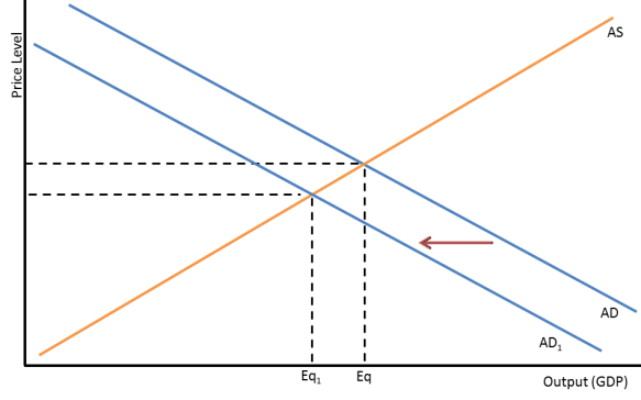
The graph above shows how unemployment in the region has affected growth prospects for the future, as shown through the movement from Eq to Eq1. The shift in aggregate demand inwards is a result of unemployment, as when people do not have a salary their effective demand is further restricted.

Evaluation:

There are clear limitations to the initial demand and supply of labour model above, this model fails to show where the unemployment is allocated (i.e. agriculture, finance, or manufacturing). Furthermore, it does not accurately represent the actual quantity of those currently unemployed. However, it does help establish the significance of unemployment as it contributes to understanding that there is a fall in aggregate demand, and therefore a dampening on growth prospects for the European Union.

The aggregate demand and supply diagram clearly shows the effect of unemployment on the European economies, and it also shows how the price level has gone down. This is true to an extent as European inflation is estimated to be at 1.8%. This identifies that in the short run disinflation is occurring within the Eurozone. This low level of inflation as a result of the drop in aggregate demand signifies that the European Union economies are struggling to achieve growth and employment. However, in the long run there may be the occurrence of reflation as the economies pursue growth, through creating more jobs and reducing unemployment.

The continuous unemployment and resultant fall in aggregate demand will have a negative effect on European manufacturing. There are already signs that business activity is diminishing (PMI=46.8 Contraction), and further unemployment will only hinder European manufacturers.

Currently across the Eurozone governments are pursuing austerity budgets to attempt to reduce debt, and climb out of recession. However, this is keeping unemployment at high rates. This attributes to a Keynesian solution of spending more to save more. If governments were to create more debt in pursuit of structural investments there may be a spur in economic growth. This can take the form of updating road networks, creating new airports, and building factories. This would help significantly aid in reducing unemployment rates in countries such as Greece, which need an infrastructural upgrade regardless.

Monopoly – Theory of The Firm

Monopoly Abnormal profit

The above diagram represents the existence of a monopoly, due to the abnormal profit shown. The firm operating at this point is profit maximizing, and abnormal profit means that they have more profit than they need to break-even at the point of normal profit.

Through this graph it can be noted that the firm is not a maximum productive efficiency, as the condition for a firm to at maximum productive efficiency would be to produce at the lowest point of average total cost.  It can be noted that the firm is operating just above the lowest point of average total cost. The reason this represents maximum productive efficiency is because all of the costs of the firm are being met by revenue generated by the sold products.

Furthermore, the firm is not operating at the point of maximum allocative efficiency. This can be identified through the fact that the price at the point of profit maximization is not equal to marginal cost. This lack of allocative efficiency represents a type of market failure (in this case the existence of monopoly), this is shown by the dead-weight loss which is the highlighted triangle in the graph.

Theory of The Firm – Profit Maximization

Marginal revenue displays the added revenue from each product sold, the reason the line has a negative gradient is the factor that as there is a greater quantity supplied there is a lower price, as the product is less scarce. When marginal revenue crosses the x-axis in a graph it can be noted that every product produced from that point on-wards takes away from revenue.
Picture1

Through the understanding of the nature of marginal revenue, we can produce a model curve for a firm’s total revenue. It can be noted that the x-intercept of the marginal revenue graph represents the point at which the total revenue graph is at the peak.

Picture2

Marginal cost displays the added cost from each product sold due to the factors of production being employed such as labour, materials, etc. Marginal cost represents all of the variable costs of the firm, and how there is an increase in cost when more is produced. However, average total cost allows us to see what the firm should actually pay for production.

Picture3

Average total cost involves the average variable and fixed costs. The curve displayed above is of the average total cost in the short term. The curve is in a negative gradient as long as marginal costs do not exceed the average total cost, the initial negative gradient can be explained as average fixed costs declines as quantity produced increase, as factors such as the factory are becoming more efficient. The reason the gradient increases is because of the greater increase in marginal cost whereas average fixed cost does not radically change to counteract. This is further explained by the law of diminishing marginal returns.

The understanding of average total cost allows us to use the profit maximization point of marginal cost and marginal revenue graph to analyse what the total revenue is and what the total cost is, enabling the actual portion of profit from production.

There are two examples below, the first one display’s firms operating at point of profit making, and the second an example of loss making. Notice the distinct difference between them as the gradient of average revenue or the position of average total cost. As there are a variety of factors present in the positioning and gradients of each curve and line, it is important to look at what are the points to look at for profit maximization The average revenue line is used as it represents the demand curve, and the average total cost curve is used as it represents the operating costs of the term when a given quantity is supplied. This allows revenue to be worked out through price x quantity, where the quantity at profit maximization meets the average revenue line and average total cost curve.

Graphs to be edited

Picture4

Picture5